A47 Media : turning an AI creator studio into a warm, editorial space for everyday creators

Bringing A47’s creator studio and its website back to one brand, from the competitor research and personas to the design directions and the launch, so that making something with AI feels inviting instead of intimidating.

Project overview

Role:
Product designer
Team:
The A47 engineering team
Year:
2026, ongoing
Website:
a47media.com

What I worked on

  • Competitor research
  • Moodboard and design directions
  • Personas and user journey
  • Homepage design and prototype
  • Studio UI

A47 was opening its AI studio to creators. The studio and the website didn’t look like the same company.

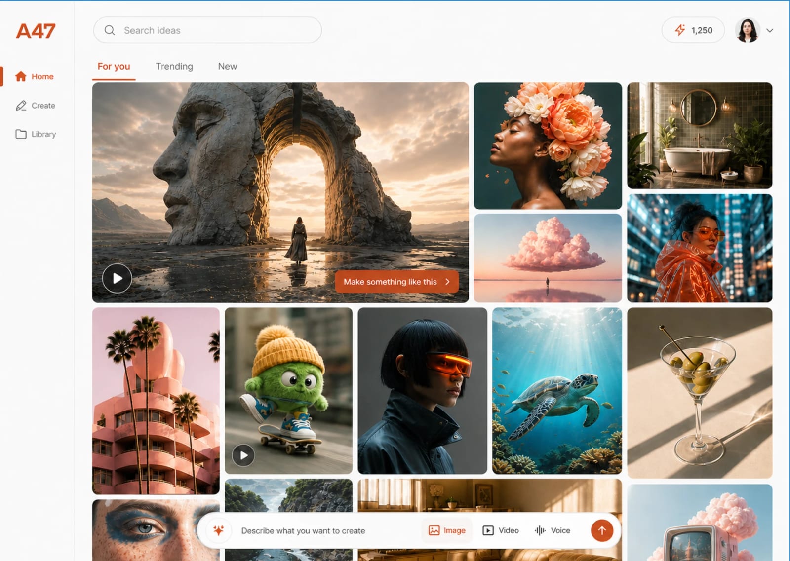
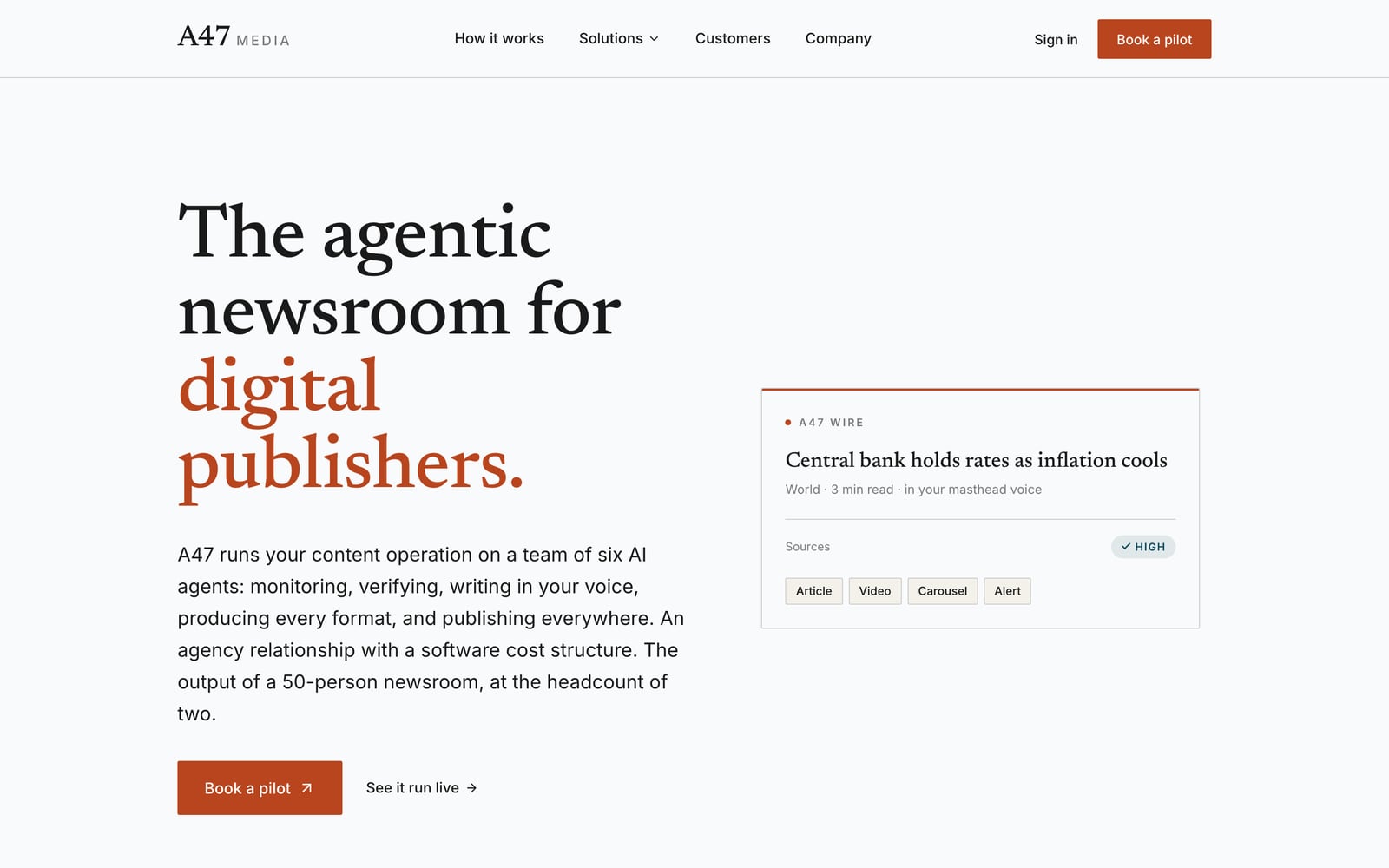
When I started working on the Creator Studio, the first thing I noticed was that it didn’t feel like A47 at all. The studio wore a bright orange theme of its own, while the official website spoke in a calm serif with a single rust accent. Both were designed before I joined, and somewhere along the way they had drifted apart.

That gap matters more than it sounds. The people we wanted to welcome aren’t AI experts. They’re small business owners and marketers who just want something good to post, and it’s hard to trust a tool that looks like a stranger every time you click through.

The Creator Studio A bright orange theme of its own

The Creator Studio before the redesign: an orange A47 logo, an orange menu and a gallery of generated pictures over a prompt bar with an orange button.
A47’s website in September 2026: ‘The agentic newsroom for digital publishers’ in a large serif, the last two words in rust, beside a small news card.

The official website A calm serif and one rust accent

The approach

I started by looking outwards. I gathered the homepages of fifteen AI creative tools and pinned them side by side on one wall, each captured from the very top to the footer, so I could see what everyone was saying and, more importantly, how they were saying it.

Laid out like that, the patterns were hard to miss. Some pages show: they open on a gallery and trust that you already know what you want. Others tell: they walk you through the process one step at a time. Seeing them together let me pick the pieces that had truly earned their place, and leave behind the ones that only made a page louder.

What stayed with me most was how few of them spoke to an actual person. Almost every page talked to “creatives” or “professionals”, and that felt like the opening for A47.

A wall of fifteen long homepage captures hanging side by side, softened so that none of them can be read.
Fifteen homepages, captured from top to bottom and read side by side.

James and Jenna

To keep the research human, I wrote two personas for the people most likely to open the Creator Studio. James runs a two-person cold brew brand and makes his content late at night, after the orders are packed. Jenna is a marketing manager at a fintech, with a team of three and a content plan that keeps growing.

Neither of them is looking for AI art. James wants Tuesday’s post done, with his real can in it. Jenna wants every blog to become a week of posts that still look like her brand. I built them from desk research rather than interviews, so I treated every detail as a hypothesis we could test after launch.

A line drawing of James: curly hair and square glasses.

Solopreneur

James

Runs a two-person cold brew brand. His Instagram has been quiet for 11 days.

“I don’t need AI art. I need Tuesday’s post done, and it has to be my can.”

What he’s hiring A47 for

“When my feed goes quiet because I’m busy running the business, help me put out posts that look like a real brand, with my actual product in them, without booking a shoot or paying an agency.”

What frustrates him

  • Tools that change his product
  • Model names he doesn’t know
  • Starting from zero every time
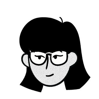
A line drawing of Jenna: a dark bob and glasses.

Marketing manager

Jenna

Marketing manager at an 80-person B2B fintech. Two blogs a week, posts every day, a team of three.

“We don’t need more ideas. We need every blog to become a week of posts, and none of it can look fake.”

What she’s hiring A47 for

“When we publish a blog, turn it into a week of on-brand posts for each channel and line them up for approval, so my team ships every day without rebuilding the same idea five times.”

What frustrates her

  • Rewriting the same idea five times
  • AI that looks like AI
  • Tools that create but don’t post

Then I mapped James’s first two weeks with A47 as a simple journey, from a late-night scroll to a finished post. It showed me what his first visit has to get right, and exactly where we could lose him.

James’s first two weeks

From a Sunday-night scroll to “Tuesday’s post is done.”

The dot sits further right the better he feels.

  1. 01LandCurious, sceptical
  2. 02Open a recipeInterested
  3. 03Sign upRelieved
  4. 04Make the first oneLet down
  5. 05Fix what’s almost rightWon back
  6. 06Keep itMixed
  7. 07“Want this every week?”Hooked
  8. 08Come backConfident
  9. 09Credits run lowStuck
How James feels at each stage. Stage four is where one warped label could lose him, and stage five is where we win him back.

Three design directions

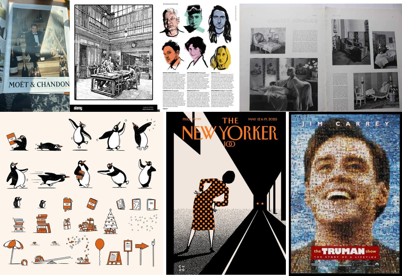
With the research in hand, I put together a moodboard of things that felt nothing like an AI tool: old magazine spreads, print illustration, a New Yorker cover. I wanted A47 to feel like something made by people, for people.

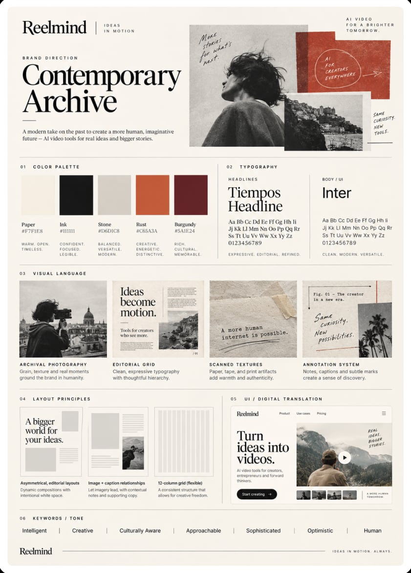
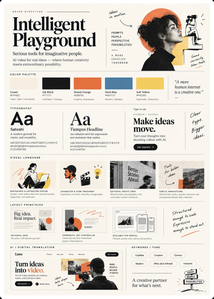
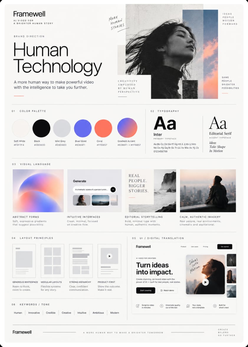
From there I shaped three directions for the team to choose from. Contemporary Archive leaned on archival photography and a quiet, bookish calm. Intelligent Playground paired an editorial serif with hand-drawn notes, serious about the tools and playful about the ideas. Human Technology was the softest of the three, all gentle gradients and open space.

I presented all three and walked the team through the thinking behind each one. Together, we chose Intelligent Playground, and here is why it felt right.

The moodboard: a champagne advertisement, an engraving of a reading room, ink portraits, old magazine spreads, a sheet of penguin illustrations in orange and black, a New Yorker cover and a film poster made of tiny photographs.
The Contemporary Archive board: paper, ink, rust and burgundy, a serif headline, archival photographs and scanned textures.
Contemporary Archive
The Intelligent Playground board: cream, ink black and a muted orange with steel blue and soft yellow, a serif beside a grotesk, hand-drawn characters and handwritten notes.
Intelligent Playground, the direction we chose
The Human Technology board: soft white, violet and coral gradients, a light sans headline and calm photographs.
Human Technology
The Intelligent Playground board, with four parts picked out: its colour palette, its two typefaces, its hand-drawn illustration and the handwritten notes in its margins.
  1. Colour

    We kept the board’s warm cream and swapped its orange for A47’s own rust, so the page feels like paper and still belongs to A47.

  2. Type

    An editorial serif beside a clean grotesk. It reads like a magazine, calm and confident.

  3. Illustration

    Simple hand-drawn characters with real personality, to keep a clever tool from feeling cold.

  4. Notes in the margin

    Handwritten notes and little arrows, as if someone had just scribbled an idea down. They make the page feel human.

  5. Palette

    Rust #973126, charcoal #242424, cream #FDEED8, yellow #FFE8A3 and teal #37505C.

The homepage, version by version

I built the homepage in code, so the team could click through a real page instead of imagining one. The very first version still wore the studio’s orange. A few versions later the editorial direction arrived, with its serif headline and little handwritten notes.

From there, I brought that same spirit into A47’s own colours and type, following the brand guidelines the company had already set. The placeholder pictures gave way to real work made with A47, and the page finally felt like it belonged to the company it was speaking for.

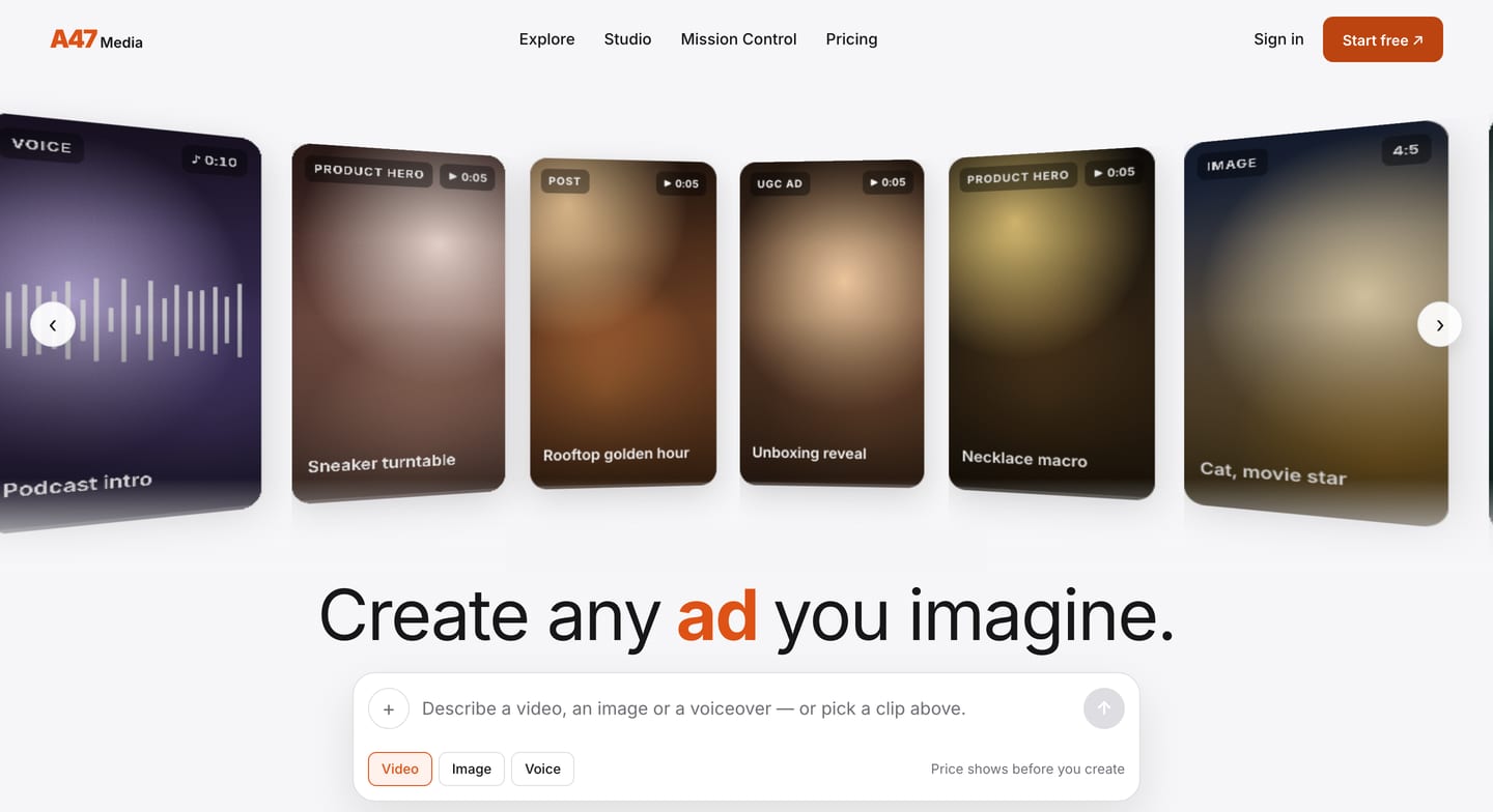
Version 2 of the homepage: an orange logo and button, a curved wall of placeholder cards, ‘Create any ad you imagine’ with the word ad in orange.
Version 2. Still in the studio’s orange.
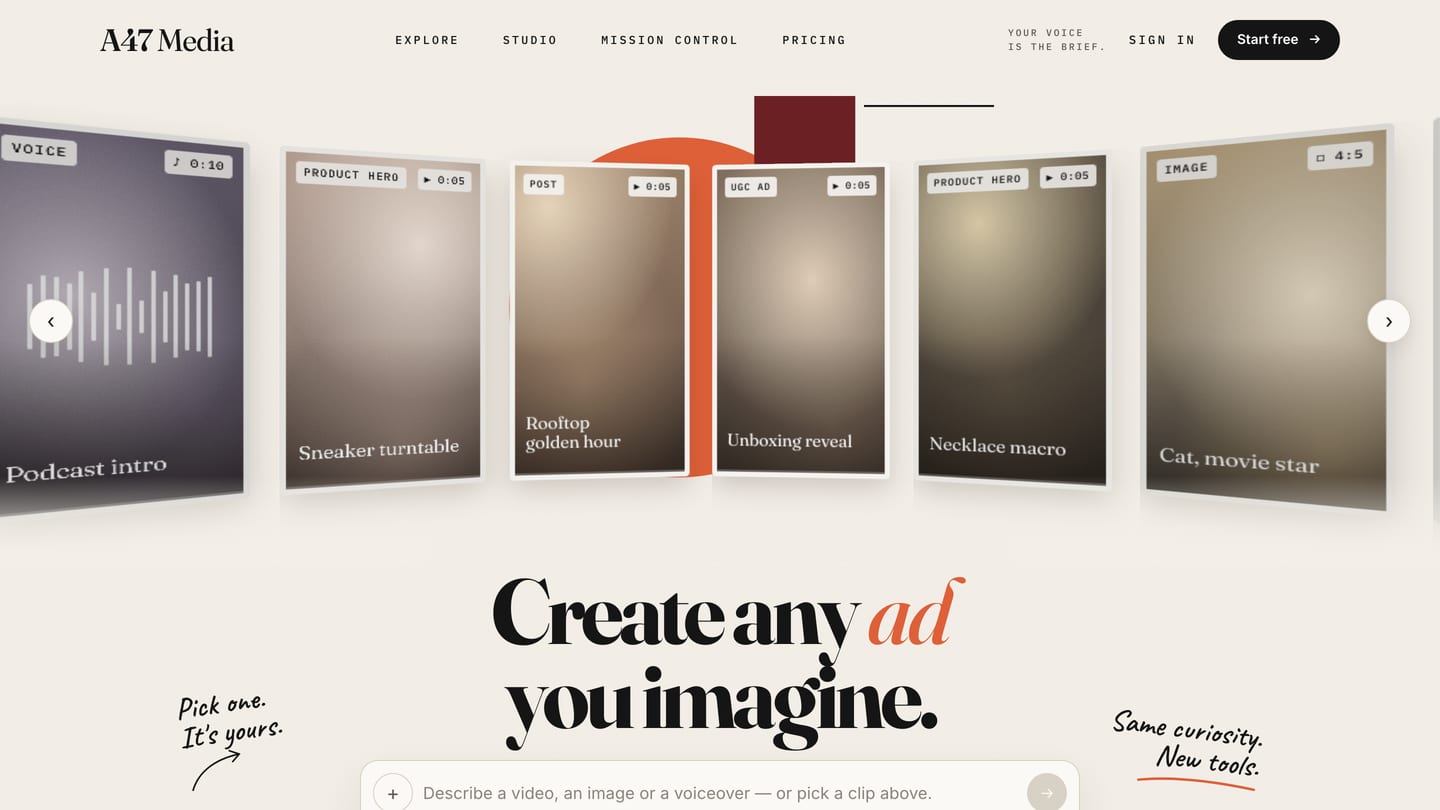
Version 6: a cream page, a serif headline with ad in orange italics, handwritten notes beside it and a rust collage behind the wall.
Version 6. The editorial direction arrives.
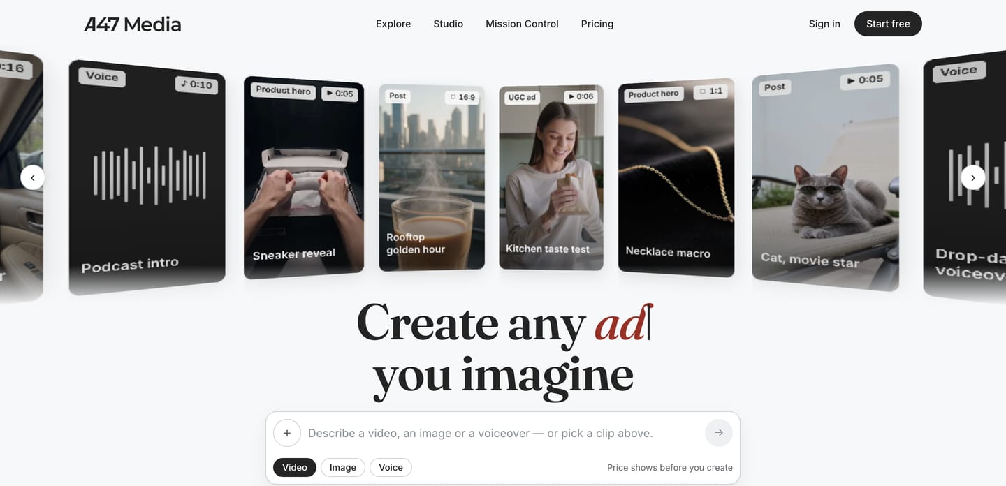
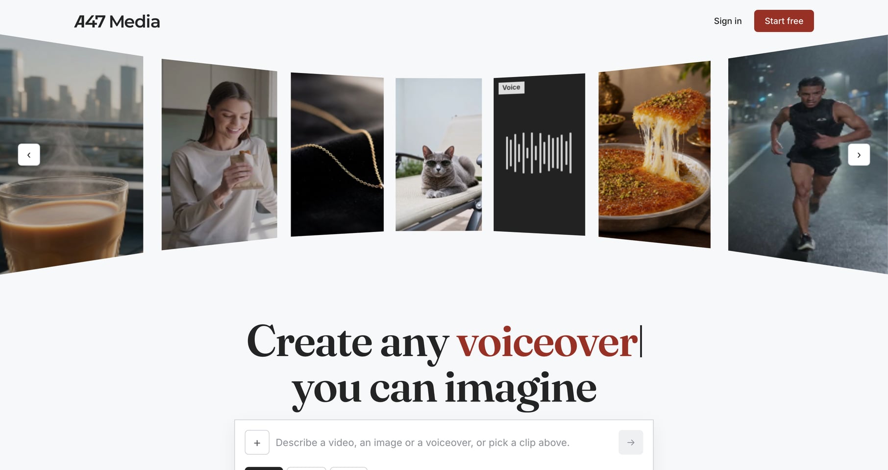
The final version: A47’s charcoal and rust, real photographs and clips on the wall, ‘Create any ad you imagine’ over the prompt box.
Final version. A47’s own colours, with real work on the wall.

Applications across the homepage and the studio

The new direction went into the homepage first. Instead of an empty prompt box, a visitor is greeted by a curved wall of finished work, a pattern I picked up from the research and filled with pieces made on A47. Pick any one and its prompt types itself into the box, so you begin from something that already works instead of a blank page.

Then the studio followed. Its main screens moved off the orange theme and onto A47’s own colours and type, so stepping from the website into the studio finally feels like staying in one place. Every tool lives in one menu, and the price shows before you generate, because nobody enjoys a surprise at the end.

The launch

Once we had agreed on the direction, things moved quickly. A47’s engineers reviewed the prototype I had built and shipped it, and the first version of the homepage went live just five days after my first prototype.

The work is still going. Every screen that moves onto the new look makes A47 feel a little more like one company, and a little more like a place where a first-timer is welcome.