Grof : turning a corporate services firm into a warm, human financial sidekick for founders
Repositioning Sprout Asia as Grof, from the positioning workshop to the brand guidelines, social templates and website, to make compliance and finance feel less intimidating.
Project overview
- Role:
- In-house designer and content marketer
- Team:
- Logo and colours by another designer
- Year:
- 2022
- Website:
- grof.co
What I worked on
- Positioning workshop and statement
- Brand guidelines (around the new logo)
- Social media templates
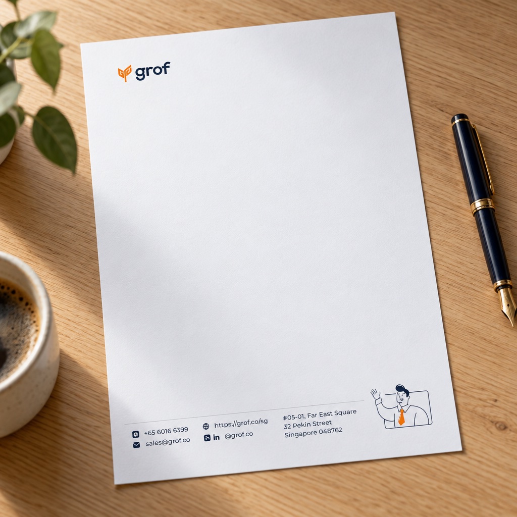
- Swag and email signatures
- Website redesign
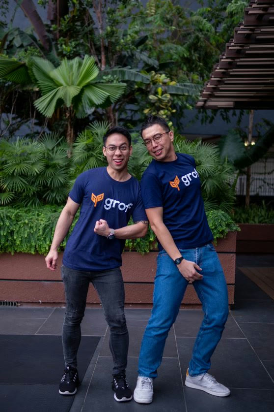




Compliance already intimidates founders. Sprout Asia’s brand wasn’t helping.
The brief was to rebrand Sprout Asia into Grof, a fresh, tech-driven identity for a firm growing into a financial platform, with its core services intact. Its visuals and tone were inconsistent: mismatched colours, unclear language and templates that didn’t agree with each other.
Our clients are founders of SMEs and startups in Singapore. They’re busy, they’re not finance people, and every other provider talked to them like a bank.
Sprout Asia, before
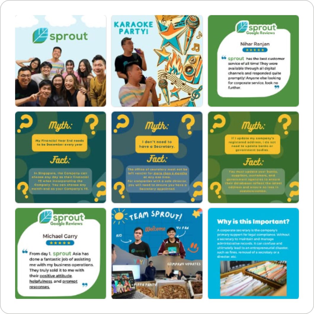
Flat, bright pops of colour
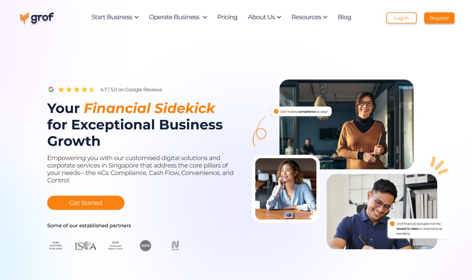
Grof, after


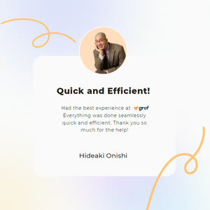


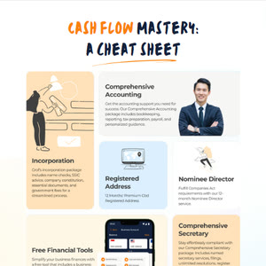


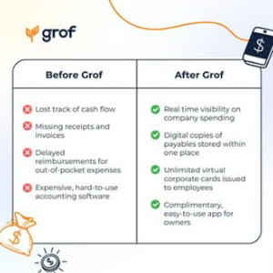
Pastels over soft gradients
The approach
Grof stems from growth, from seed to full bloom. In place of Sprout Asia’s flat, bright pops, I gave founders pastels over soft gradients and a scrapbook of doodles, hand-drawn illustrations and real people: warm and inviting, and still modern.

- Logo
A seedling, for a firm named after growth. Drawn by another designer; I built the identity around it.
- Doodles
Hand-drawn rings and strokes, like notes in a scrapbook, keep it warm and inviting.
- People
Real people, cut out like stickers. Founders see a face, not a bank.
- Colour
Orange and navy over pastels and soft gradients, in place of flat, bright pops.
- Palette
Navy #13213D and orange #FB810E, with peach #FFC376, sky #BBE5FF and a soft gradient of lilac, cream and sky.
Applications across different channels
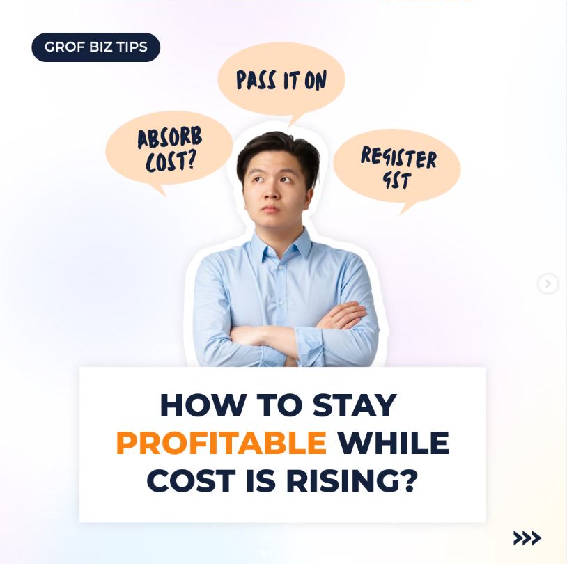
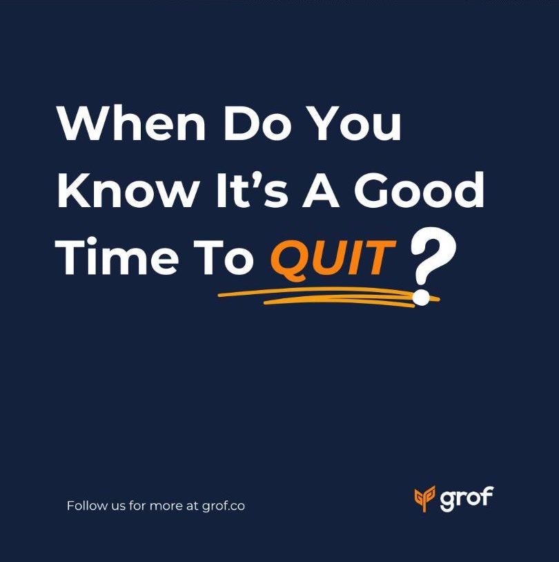
These visuals became the foundation of our unified brand identity, consistent across our social channels, website and marketing materials. Business tips in plain words, and the hard parts, like staying out of trouble with LHDN, said the way a friend would.

Product launch video: Grof Corporate Card
I made the demo video for the Grof Corporate Card, a business account for owners to manage their own finances. Think Wise, for business. My job was to turn our product screens and use cases into a story about why it matters to a business owner. Here are a few of its moments, on a silent loop.
The impact
The rebrand strengthened Grof’s recognition after launch. Our LinkedIn following grew by 30% after rollout, and clients told us the refreshed look felt more approachable.